Wednesday, September 29, 2010

stress-free livin'


ATTENTION: All stress has been lifted.
I just found out my BEST FRIEND IS COMING TO TOWN THIS WEEKEND!!!!


my best friend in the whole world - GENO!
the only thing that will ever come between us is Oklahoma.


PLUS - citizen cope show on monday.. my 7th time seeing him
i might be a little obsessed...
things are looking up!


"all jokes,
no stress.
love.
live life.
proceed.
progress."
Lil Wayne ;)


- J.

Tuesday, September 28, 2010

helvetica lovin'


font classifications:
old style - old style typefaces contain a great contrast between thick and thin strokes, and more refined. serifs in old style have more wedge shaped ascenders. the letters do not have much stress and are generally upright. old style is sturdy without being heavy and based on handwriting. some examples are: goudy old style, janson, palatino, and perpetua
transitional - transitional typefaces have sharper serifs and high contrast as well. they are between modern and old style (hence the name) and include times and baskerville.
modern - modern typefaces have thin, straight serifs, vertical axis, and an extreme contrast from thick to thin strokes. the serifs are thing and the vertical lines are heavy. bodoni and didot are examples. modern fonts are generally less legible than the others.
slab serif - slab serif typefaces are heavy, bold, and decorative. these typefaces are mono weight were born in the 19th century for advertisement use. examples are: courier and rockwell
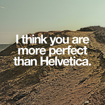
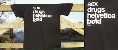
sans serif - sans serif typefaces can be classified into grotesque, neo-grotesque, humanist, and geometric. the characters have no serifs. they are generally used for on-screen readability. some examples are: helvetica, franklin gothic, ms sans serif, lucida grande, myriad, trebuchet, tahoma, verdana, futura, and century gothic.

now....
helvetica is a sans serif... neo-grotesque
max miedinger is credited for the typeface.
it was created in 1957 (older than my momma)
BUT - it was revamped in 1983 by D. Stempel AG and this new and improved font is named helvetica neue.
helvetica would definitely be a huge greek family if it were human... it contains regular, fractions, light, light oblique, oblique, black, bold, fractions bold, black oblique, bold oblique, compressed, condensed light, condensed medium, condensed light oblique, condensed oblique, condensed black, condensed bold, extra compressed, ultra compressed, condensed black oblique, condensed bold oblique, not to mention the whole helvetica neue fam.


all letterforms sit (or slightly swoop below) the baseline
the height from baseline to the top of the letterform is the cap height
x-height is the height of the lowercase x of a typeface
serif style includes serifs in the typeface
the weight of the character is called the stroke weight
the apex is the highest point of a letterform, like the uppercase A
vertex is the bottom of the character where the lines form a point, (v, w)
final/terminal is the bottom curve or tail on the lowercase a, but generally seen in lowercase d or b as well
barb is the part that gets cut on the top of a C
on a G, a spur connects the bowl and the serif
an ear is the part that hangs off a lowercase g (serif)
a loop is the lower part of a lowercase g
a link connects a bowl and loop in a lowercase g
1/2 story indicates a lowercase a or g <>
a capital Q has a tail
capital R's and K's have legs


-J.

Saturday, September 25, 2010

college lovin'


this is me right now (on GAME DAY-football season=my favorite season of the year)
while there is a tailgate party going on in my house...

goodbye jamie's life, you were fun while you lasted!


- J.


Tuesday, September 21, 2010

robert frost.


"That day she put our heads together,
Fate had her imagination about her,
Your head so much concerned with outer,
Mine with inner, weather."
-Tree at My Window

"Two roads diverged in a yellow wood,
And sorry I could not travel both
And be one traveler, long I stood
And looked down one as far as I could
To where it bent in the undergrowth;

Then took the other, as just as fair,
And having perhaps the better claim,
Because it was grassy and wanted wear;
Though as for that, the passing there
Had worn them really about the same,

And both that morning equally lay
In leaves no step had trodden black.
Oh, I kept the first for another day!
Yet knowing how way leads on to way,
I doubted if I should ever come back.

I shall be telling this with a sigh
Somewhere ages and ages hence;
Two roads diverged in a wood, and I-
I took the one less traveled by,
And that has made all the difference.
-The Road Not Taken


Robert Frost is genius...
This was a slight mockery about Frost's friend, who would choose a direction for their walks, then get angry with himself for not choosing a different and more interesting way.
Frost didn't approve of "sighing over what might have been."

Chin up.
- J.


Monday, September 20, 2010

horses are overrated.


today's thoughts :

"Sometimes there are two very opposite directions, and we go with the stronger one at the end. It's an impulse thing, like, 'Oh, I love both so much, but it's got to be one or the other because the two don't work together.'
"
- Marc Jacobs, my favorite fashion designer

"Only when the design fails does it draw attention to itself; when it succeeds, it’s invisible."
- John D. Barry http://johndberry.com/


"Helvetica is the jeans, and Univers the dinner jacket. Helvetica is here to stay."
-Adrian Frutiger


oh, AND...


It's VERY safe to say that I definitely liked horses more when I was 5...

- J.


Thursday, September 16, 2010

typography lovin'


weather compositions are far from over.
to spice up weather a little bit and relate it to my life...

"t-t-talk about the weather" -Dave Matthews, So Much To Say

and something about typography in general:


- J.

horsin' around.


this website is outrageous & i love it.

http://www.foundshit.com/tag/horse/


toodles,
- J.

Monday, September 13, 2010

mess with the bull, you get the horns.

Wick Jacobi, my Godfather, has been the most influential person in my life.
He got me into South Park at a young age, and more importantly Entourage.
He is my best friend's father.
He is my second father.

The Jacobi's lived next door to me for 8 years, and I consider them family.

Wick has owned his design firm, Wick Jacobi Design Group since 1994.
Since then, he has worked for many well-known companies such as Playtex, and famous celebrities like branding and pitching a line for Brad Pitt.

He is incredibly talented, and I hope to be his intern this summer in Greensboro, North Carolina.


He always used to say "Jambalay, you mess with the bull... you get the horns."
This time, I messed with a horse... what do I get for that?

Love you, Wick, and all that you do.
Thanks for being there for me all these years.

-Jambalaya

Sunday, September 12, 2010

Horses.

I love drawing horses.

WHY DID I PICK A HORSE?

-J.

Monday, September 6, 2010

Frutiger

Adrian Frutiger, aside from being possibly the cutest old man I've ever seen, designed more than 170 typefaces, most of which are used daily. His two most accredited typefaces include Univers and Frutiger.

He is a Swiss designer, which is represented by traditions in some of his work.
He was born in 1928.

Frutiger found a strong passion for calligraphy and the lettering associated with it, as well as the relationship between black and white.
"Taking black away means adding white. In this way, the space between an R and an S becomes like a sculpture for me.” -Adrian Frutiger

Frutiger was also a painter, sculptor, author, and mathematician.


The different weights of the type family of Univers are represented by the use of numbers, instead of names. Right now, Univers had 44 faces with 16 numbered weight combinations.
The weights include:
Ultra light, thin, light, normal, medium, bold, heavy, black, ultra black
2 3 4 5 6 7 8 9 10


The Univers grid shows the variations of the typeface and how the variations are different than the next.